Passion project design
To start the passion project, I made a few sketches of what I had in mind when it came to the website. Below are screenshots of the sketches I've made along with the feedback I received on them.
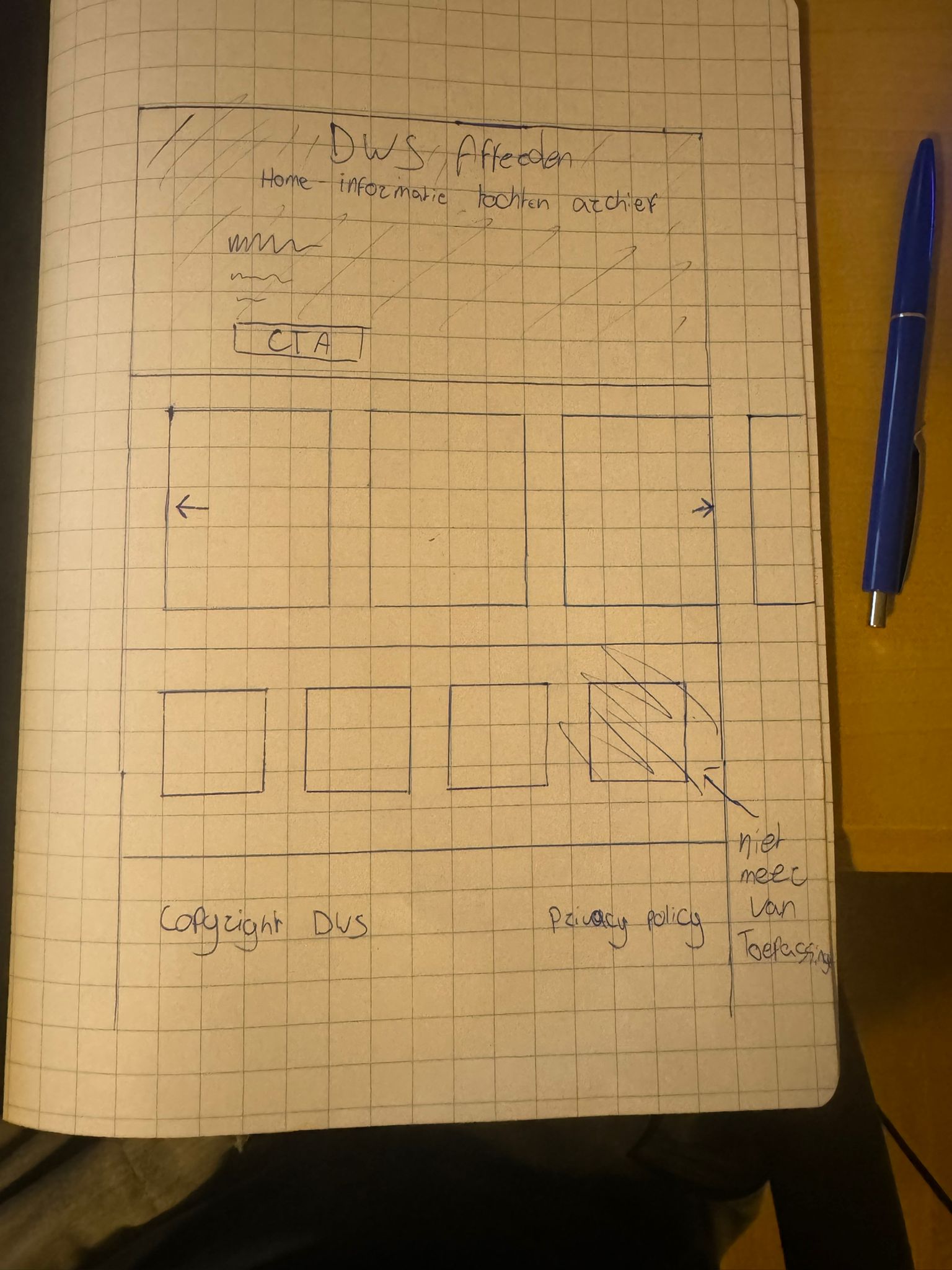
The first sketch I made was a simple design with a navigation bar on the top with the name of the website above in front of a background. Underneath are all the upcoming hiking tours that slide on and off the screen from the right side. Just below this are the sponsor logos. Lastly we have the footer with the copyright and privacy policy.
The feedback I received from this is: The page looks good however one of the sponsor images could be removed because we are no longer members there. It would be nice if we as a club could add hikes ourselves and then they would be listed in the upcoming hikes. To which I replied with that I'd take a look into this, but won't promise it as a feature just yet.
Next we have the cards:
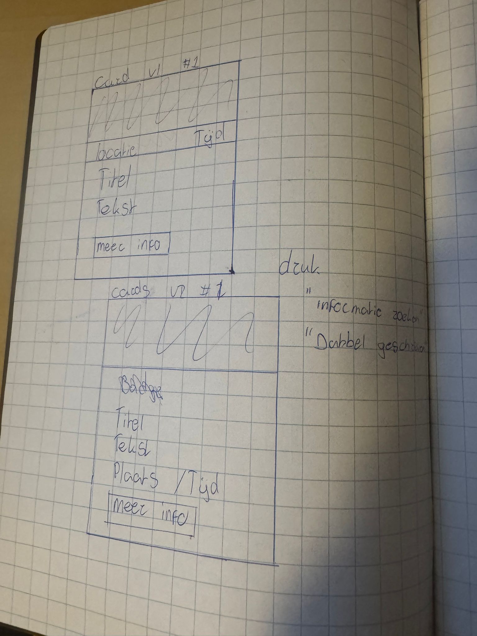
I made 2 different but similar versions to see which one my stakeholder would like more. The feedback I received was: The 2nd card is better. However, it is on the busy side and I am more of a searcher for information. I would remove the text and put it behind more information otherwise it is written two times. Keep the title and the image. Replace the place and time by just a date. If people want more information they will have to click more information.
With this feedback I made a new version of the cards:
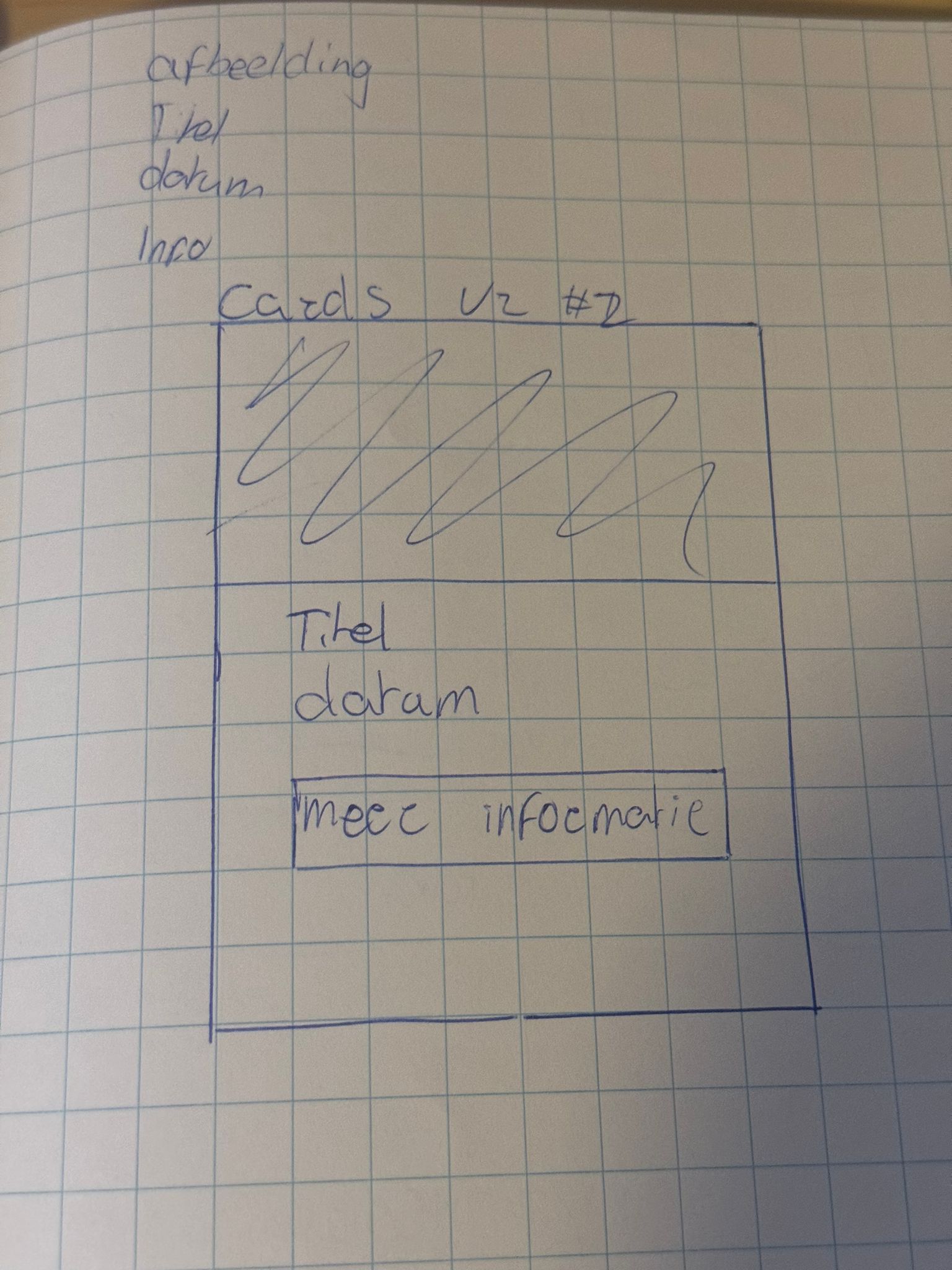
This is the second version of the cards which was given the "green light". I kept the image, title and replaced the place and time with the date.
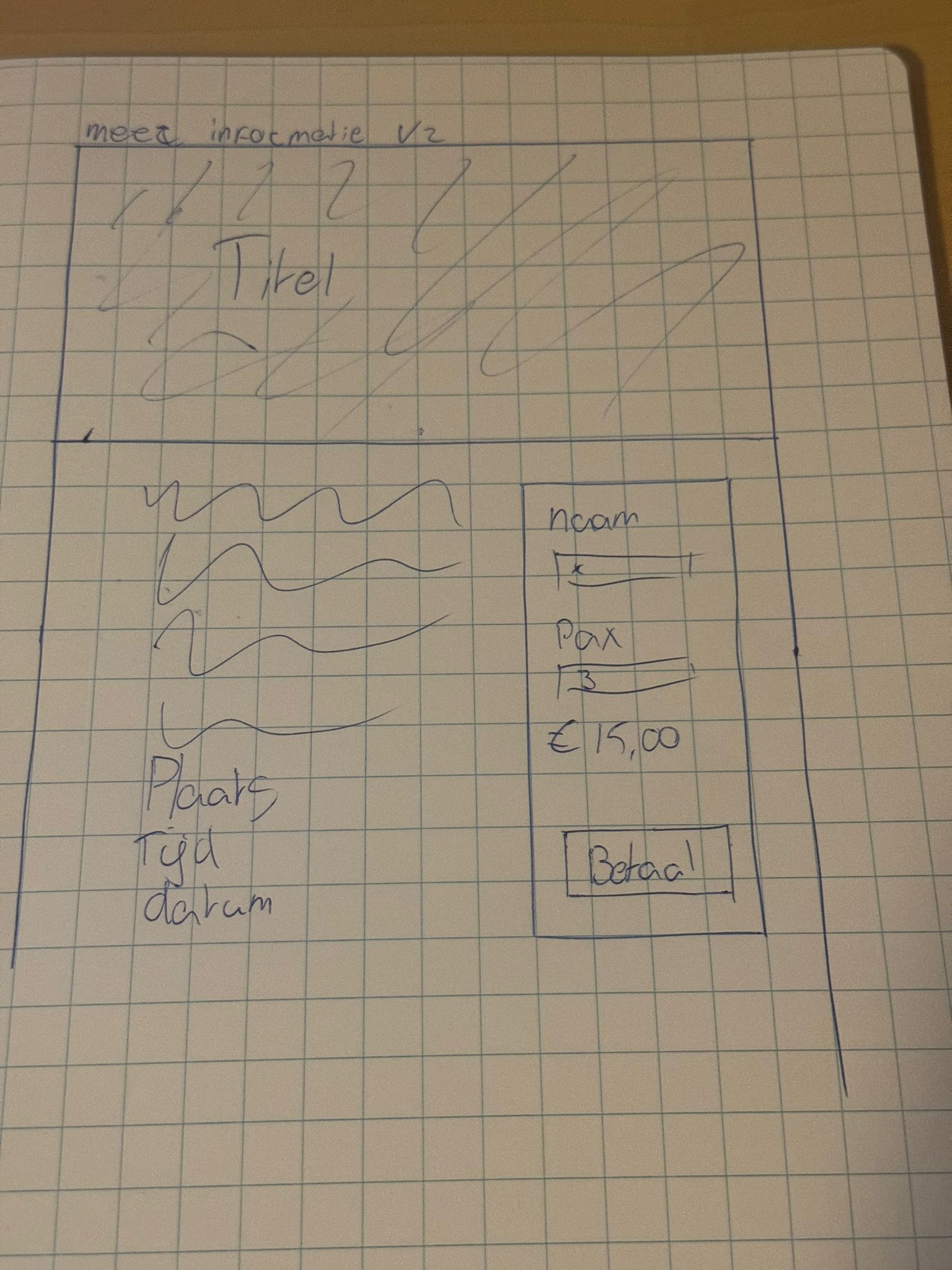
After this I made a design for the more information page to get a feel for what I would like this to look like. I took a rough inspiration from product pages. Such as this. The only thing I changed because it just couldn't fit was the images of the product. I moved the main information to the left and on the right I added a sidebar where people could sign up for the hike if they aren't members of the organization.
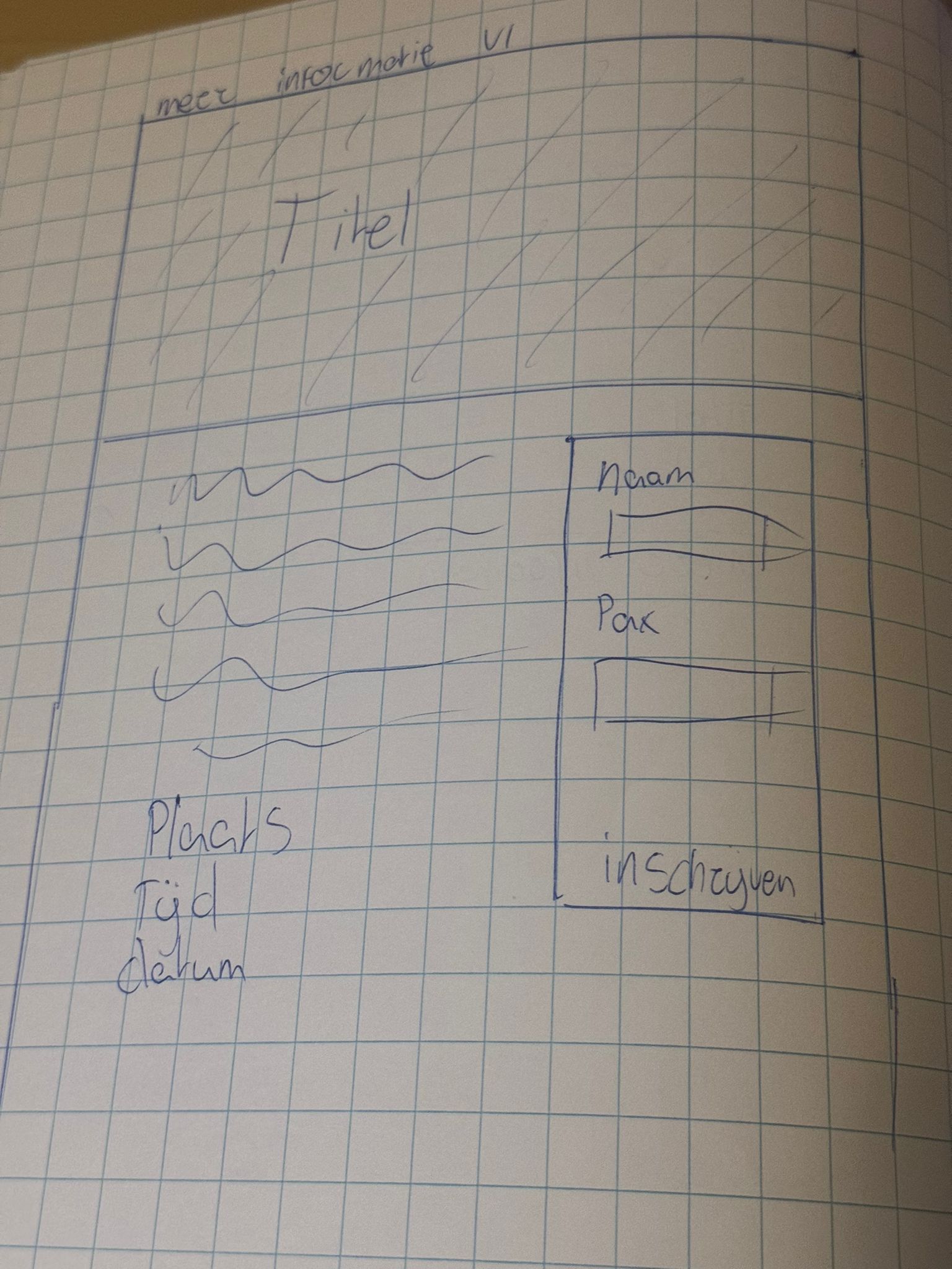
The more information page was an instant hit. The only thing that I needed to change was the sidebar part. It was mentioned that there are some hiking routes that cost money to follow, so my question was if I could add a spot for the price. The full feedback was: Looking at the more information page. There are routes that cost money and the sign up window could reflect this. Is it possible to add a payment transaction behind the sign up form? To which I replied that it is possible via "Stripe" and that I have worked with it before but that there are transaction costs for each transaction. I will look into this further to see what the options are.
With this in mind though, this is the second version of the more information page.
This version was also good. I will now go to Figma and make a few wireframes from these sketches.